Meet the concept
YumBum sells layered, colorful treats for everyone with a sweet tooth!
Before the magic
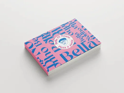
The entrepreneurs of YumBum, an expansion of parent company ManQal Grab & Grill, previously collaborated with our designers on a Brand & Design process for their establishment Bella Di Nonno. They wanted to open another business and capitalize on the sweet trend – YumBum was therefore brand new and ready to become a bold brand. In fact, they even enlisted our help for the name. The branding primarily needed to exude softness, 'kawaii' (= Japanese cuteness), and the colors of the rainbow, representing the product range.
How we made them wooow
Package: Complete Brand
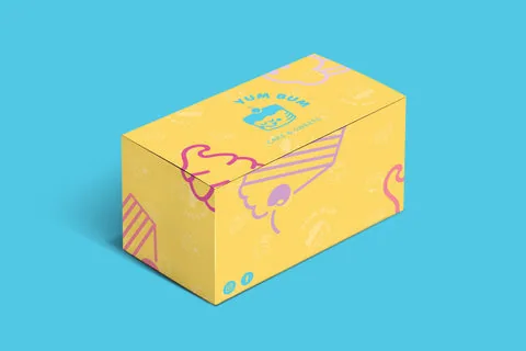
First, as much inspiration as possible was gathered and mood boards were created within the given frameworks, featuring shapes of pies, cupcakes, red velvet, layered cakes, and carrot cakes. The resulting choices are based on taste experience: soft colors represent the creamy filling and cake biscuit, while fresh colors were drawn from fruits. This formed the color palette.
Inspiration for the illustrations came from the product range. These include fruit and layered cake – which is a YumBum specialty. To determine the font's shape, extensive experimentation with characters was done, as the name YumBum offers many possibilities. Rounded shapes ('bum') with an expression that conveyed 'yum' were chosen. The font was created in the same way: a playful, rounded font combined with a light, fresh letter.
About the branding
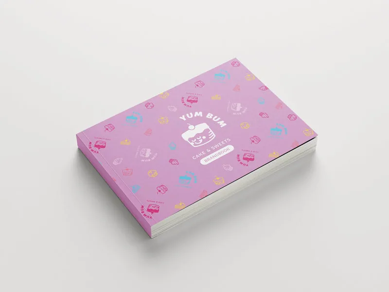
Characters are central; this cake truly brings YumBum to life. The logo represents the reaction of every sweet tooth encountering their range: ‘yum!’! Additionally, it also consists of layers, just like their cakes. The colors were chosen based on the famous rainbow cake and fruits.
Curious about what we can do for you? With effective branding, you too can make the right impression on your guests. Request a no-obligation quote and speak with an expert.